Pantone PMS Color Book for Screen Printing Ink Matching
Color inconsistency in screen printing leads to wasted materials, costly reprints, and unhappy clients. Mistakes in color matching can damage trust and lower market value. The Pantone book for screen printing provides a reliable standard that helps printers achieve accurate colors every time. Printers who use this tool see fewer errors and higher customer satisfaction. Production quality improves, and brands gain a stronger reputation in the market.
Risks of Color Inconsistency
Color inconsistency is a major challenge in screen printing. It affects both the production process and the reputation of a business. Many problems can arise when colors do not match as expected. These problems can lead to wasted resources and unhappy customers.
Production and Cost Impacts
Mistakes in color matching often cause delays and extra expenses. Workers may need to mix inks several times to get the right shade. This process uses more materials and increases labor costs. When the correct color is not achieved on the first try, printers must redo jobs, which wastes ink, fabric, and time. Efficient color matching helps reduce these issues and supports sustainability in the garment industry.
Some common risks in the production process include:
- Increased production costs from repeated color adjustments.
- Higher labor costs due to time-consuming traditional methods.
- More material waste when prints do not meet quality standards.
- The need for computerized color matching to streamline operations.
The table below shows frequent color-related risks and solutions in screen printing:
| Common Risk | Description | Solution |
|---|---|---|
| Using RGB instead of CMYK | Unexpected color shifts in the final print. | Design in CMYK from the start. |
| Color Shifts | Colors may shift when converting from RGB to CMYK. | Use a color picker and make test prints of problematic colors. |
| Monitor Calibration | Incorrect monitor settings misrepresent colors. | Calibrate monitors and trust printed proofs for accuracy. |
Client Trust and Brand Issues
Color inconsistency can damage a brand’s image. Clients expect their logos and designs to look the same every time. If colors change from one order to the next, clients may lose trust in the printer. This can lead to disputes, lost contracts, and negative reviews.
- Consistent color builds strong relationships with clients.
- Using the Pantone Matching System (PMS) for critical brand colors ensures reliability.
- Reviewing hard or digital proofs before full production helps avoid surprises.
A business that delivers accurate colors earns a reputation for quality. This reputation leads to repeat orders and long-term success.
Traditional Color Matching Challenges
Eye-Based and Supplier Methods
Many screen printers have relied on visual judgment to match colors. Workers compare ink samples to printed designs or fabric swatches. This method depends on the human eye, which can see colors differently under various lighting conditions. Fatigue, mood, and even age can affect how a person sees color. These factors make eye-based matching inconsistent.
Some printers ask their ink suppliers to match colors. Suppliers may use their own formulas or reference samples. This approach can lead to differences between batches. Ink from one supplier may not match ink from another. Even small changes in raw materials can cause visible shifts in color.
Common problems with these methods include:
- Inconsistent results from batch to batch.
- Delays when waiting for suppliers to mix and deliver inks.
- Disputes with clients over color accuracy.
Tip: Eye-based methods and supplier formulas often fail to deliver the same color every time. This can lead to wasted materials and unhappy customers.
Need for a Standard System
Screen printing businesses need a reliable way to match colors. A standard system helps printers achieve the same results, no matter who mixes the ink or where the job is printed. Consistency builds trust with clients and reduces costly mistakes.
Mr. Gupte states that “the colour matching systems provide significant help to the colourists in his day-to-day colour problems. However, the color matching system works best where there is a reproducibility or repeatability of the process.”
- Color matching systems are crucial for achieving reproducibility and repeatability in color processes.
- Standardization in processes and raw materials is essential to maximize profits and improve color accuracy.
A standard color matching system, like the Pantone Matching System, gives every printer a common language. Printers can communicate exact color codes with clients and suppliers. This reduces confusion and ensures that every print run meets expectations.
Pantone Matching System Overview
How PMS Works
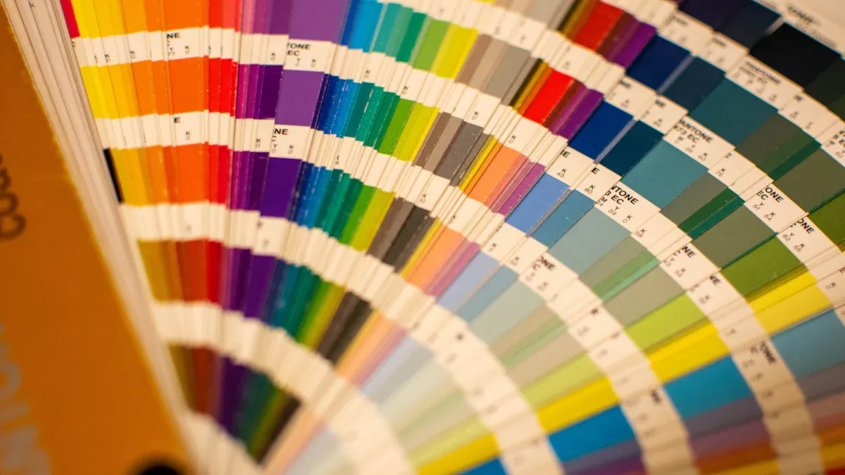
The Pantone Matching System, or PMS, helps printers and designers speak the same language about color. This system uses a set of standardized colors that everyone can reference. Each color in the system has a unique code. Printers use these codes to mix inks and match colors exactly.
The Pantone Matching System (PMS) standardizes color to ensure consistent hues across different print jobs, eliminating guesswork in color matching. It provides a unique numerical code for each color, allowing designers and printers to achieve precise color matches. The system includes over 1,300 colors and is used in various media formats, ensuring that the same color can be reproduced accurately regardless of the material or printing process used.
A Pantone book for screen printing is a physical guide that shows all these colors. Printers can hold the book next to their prints to check for accuracy. This process helps avoid mistakes and saves time. The PMS works for many types of printing, including textiles, paper, and plastics.
Here are some key features of PMS:
- Over 1,300 standardized colors
- Unique codes for each color
- Used worldwide by designers and printers
- Works across different materials and printing methods
Role of Numerical Codes
Numerical codes are the heart of the Pantone system. Each code stands for a specific color formula. When a designer chooses a color, they give the printer the code. The printer then uses the Pantone book for screen printing to mix the ink to match that code.
The Pantone Matching System assigns unique numerical codes to standardized colors, which helps designers and printers achieve accurate color reproduction. This standardization is essential for screen printing, as it ensures that colors remain consistent across various media and locations. By eliminating guesswork in color matching, the PMS ensures that the colors used in screen printing are precise, which is critical for maintaining brand integrity and visual appeal.
A simple table shows how codes work:
| Pantone Code | Color Example | Use Case |
|---|---|---|
| 186 C | Bright Red | Sports Jerseys |
| 286 C | Deep Blue | Corporate Logos |
| 123 C | Vivid Yellow | Promotional Shirts |
Printers rely on these codes to deliver the right color every time. This process builds trust with clients and keeps brands looking sharp.
Pantone Book for Screen Printing: Why It Matters
Industry Spot Colors and Formulas
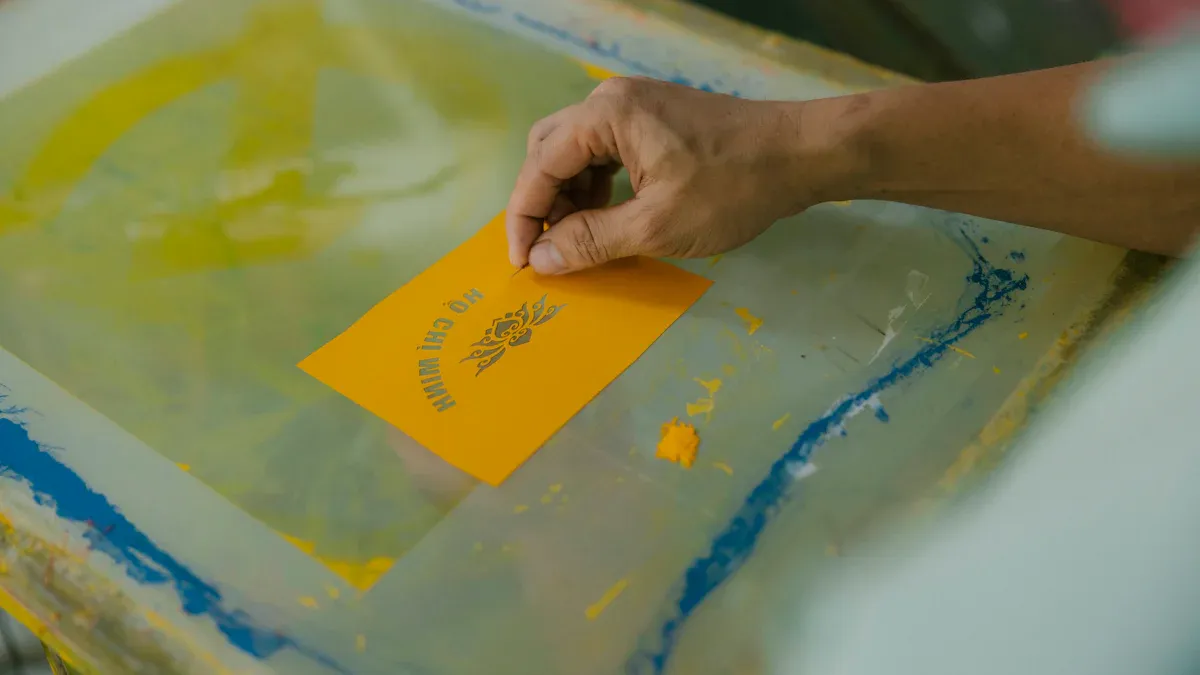
The Pantone book for screen printing is a vital tool for professionals who want reliable color results. This book contains a wide range of industry spot colors, each with a unique formula. The Pantone Color Bridge Uncoated & Coated Guide, for example, includes PMS, RGB, and CMYK color combinations. These combinations come with specific mixing instructions. Printers use 18 base colors to create hundreds of vibrant spot colors. This system allows for precise and repeatable color mixing.
Spot colors help printers achieve the same shade every time. Consistency is important for brand identity and customer satisfaction. When a client requests a specific color, the Pantone book for screen printing provides the exact formula. This reduces mistakes and saves time during production. Printers can trust that the color they mix will match the designer’s vision.
The use of spot colors also improves efficiency. Printers do not need to guess or experiment with different ink ratios. The formulas in the Pantone book for screen printing ensure that every batch looks the same. This consistency builds trust with clients and helps businesses stand out in a competitive market.
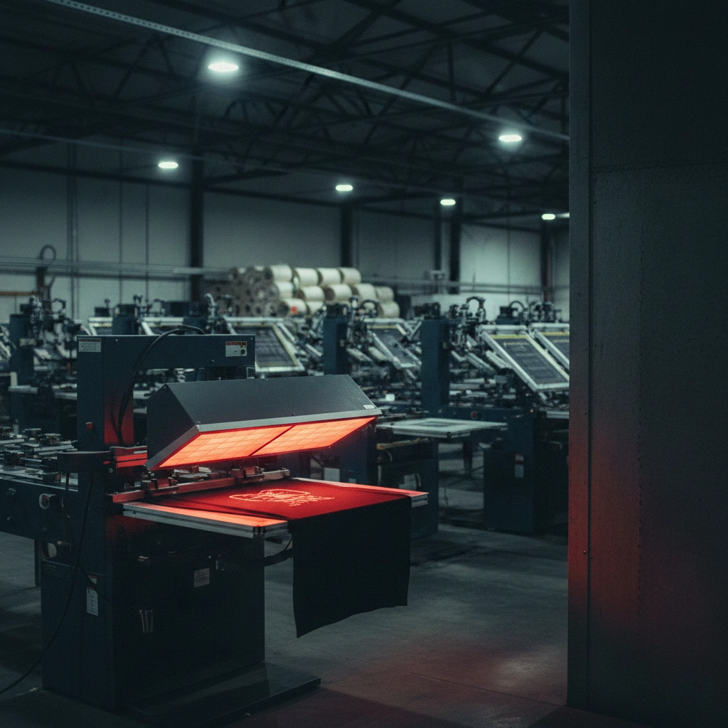
Cnding supports this level of quality by using advanced equipment and strict quality control. The company prints daily test charts to check color accuracy. Densitometers are used to measure color on every 50th or 60th sheet. Cnding also follows ISO standards, which shows a strong commitment to reliable and standardized color control.
Physical Reference vs. Digital
A physical Pantone book for screen printing is essential for accurate color matching. Digital screens can show colors differently because of brightness, calibration, and display settings. This can lead to mistakes when mixing inks. The Pantone book for screen printing gives a real-life reference. Printers can compare the printed swatch to the actual ink on fabric or paper.
- Swatch books show how the ink will look when printed.
- Digital displays often distort colors, making them unreliable for final decisions.
- The Pantone system acts as a universal language for color, helping designers and printers communicate clearly.
Color accuracy matters in every print job. A physical reference ensures that the final product matches the intended design. This is especially important for brands that rely on specific colors for their logos and marketing materials. The Pantone Validated Certification also helps by making sure that some monitors can display Pantone colors correctly. However, the physical book remains the most trusted tool for final approval.
The Pantone book for screen printing also supports repeatable workflows. Once a printer calibrates their process, they can achieve the same results across different jobs and locations. This reduces the need for custom spot inks and lowers operational complexity. Brands benefit from consistent colors, no matter where their products are printed.
Tip: Always check your ink colors against a physical Pantone book for screen printing before starting a large production run. This step helps avoid costly mistakes and keeps clients happy.
Cnding’s dedication to innovation and quality ensures that printers have the tools and support needed for standardized color control. By combining advanced equipment with the Pantone book for screen printing, cnding helps businesses deliver reliable and high-quality results every time.
Ink Mixing Steps With the Pantone Book
Coated vs. Uncoated Colors
The Pantone system uses codes to show if a color is coated or uncoated. Each color ends with a “C” for coated or a “U” for uncoated. Here are the main differences:
- Coated colors are made for glossy paper. They look bright and solid.
- Uncoated colors are for matte paper. They appear softer and less shiny.
- The finish you choose changes how the ink looks on the final print.
- There are 1,867 solid Pantone colors, each with a unique code.
When using the Pantone book for screen printing, always check if your project needs a coated or uncoated reference. This choice affects how you mix your inks and how the color appears on fabric or paper.
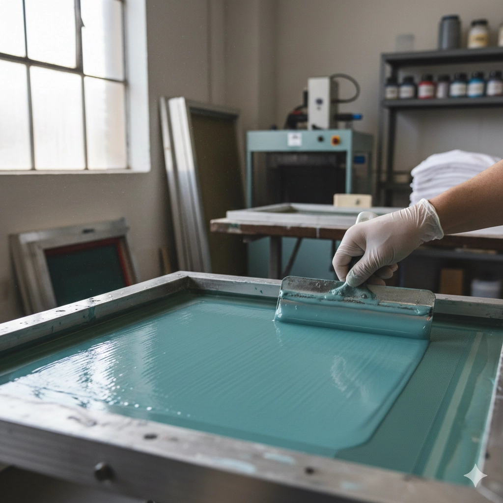
Step-by-Step Mixing Process
Mixing ink with the Pantone book for screen printing is a clear process. Follow these steps for accurate results:
- Find the Pantone color code in your book that matches your design.
- Check if you need the coated or uncoated version.
- Look up the mixing formula in the Pantone book for screen printing. The formula shows how much of each base color to use.
- Measure each base ink carefully using a scale.
- Mix the inks together until the color is even.
- Test the ink on your material. Let it dry and compare it to the Pantone swatch.
- Adjust the mix if needed, then record your formula for future use.
Cnding’s advanced screen printing equipment works well with Pantone-based workflows. This makes the mixing and printing process faster and more reliable.
Mixing Example
Suppose you need Pantone 186 C, a bright red. The Pantone book for screen printing gives you a formula, such as:
- 80 parts Red Base
- 15 parts Yellow Base
- 5 parts Clear Base
Weigh each part, mix well, and test the color on your fabric. Compare the result to the swatch in your Pantone book for screen printing. Make small adjustments if needed. This method ensures every print matches the client’s expectations.
Color Fidelity in Printing
Lighting and Evaluation
Color fidelity means that the printed color matches the intended design. Lighting plays a key role in this process. Different light sources can change how colors look. For example, daylight, fluorescent bulbs, and LED lights each have unique color temperatures. These differences can make the same print appear warmer or cooler.
Accurate color evaluation requires consistent lighting conditions. Printers should use calibrated lighting in their workspaces. This helps ensure that everyone sees the same color. Following color management standards is important for reliable results.
- Daylight-balanced lamps are best for color checks.
- Consistent lighting prevents confusion during quality control.
- Calibrated viewing booths help maintain color accuracy.
For best results, follow these guidelines:
- Use at least 200 Lux for normal office tasks.
- Increase to 500 Lux or more for detailed visual inspections.
- Take regular breaks to avoid eye fatigue during long checks.
Tip: Always evaluate color samples under the same lighting used during production. This reduces the risk of unexpected color shifts.
Managing Color Shift
Color shift happens when a color appears different under various conditions. This can occur due to changes in lighting, ink formulation, or substrate type. Managing color shift is essential for brand consistency and customer satisfaction.
Printers can reduce color shift by standardizing their workflow. Using the Pantone book for screen printing helps maintain color accuracy. Regular calibration of equipment and careful ink mixing also play a role.
- Test prints under multiple light sources to spot potential shifts.
- Record all ink formulas and process steps for future reference.
- Train staff to recognize and address color changes quickly.
A reliable color management system supports consistent results. Cnding’s advanced equipment and quality control practices help printers achieve high color fidelity. This builds trust with clients and strengthens brand reputation.
Choosing the Right Pantone Book
Selecting the Formula Guide
Selecting the right Pantone book is important for screen printing success. Printers should follow a few steps to make the best choice:
- Use Pantone Color Bridge swatch books for accurate color matching. These guides show how Pantone spot colors look when printed with CMYK inks. This helps printers see the difference between spot and process colors.
- Check colors on-screen against the physical swatches. Computer monitors can display colors differently. Comparing the digital design to the physical swatch ensures the final print matches the client’s expectations.
- Adjust colors as necessary before printing. Sometimes, colors that look good on a screen do not work well together in print. Testing and adjusting colors with the swatch book helps avoid surprises during production.
Tip: Always keep your Pantone book in a clean, dry place. Light and dust can change the appearance of the swatches over time.
Ink System Compatibility
Screen printers must understand how different ink systems interact with Pantone books. Each system has its own rules and challenges.
- Pantone PMS Spot colors are different from RGB and CMYK systems. This can cause compatibility issues if not managed carefully.
- The Pantone Color Bridge swatch books help match colors across different ink systems. They show how a spot color will look when converted to CMYK.
- Each color system (PMS, RGB, CMYK) uses its own formulas and applications. Printers must know these differences to avoid color mistakes.
A simple table can help compare these systems:
| Color System | Use Case | Notes |
|---|---|---|
| PMS Spot | Brand colors | Most accurate for logos |
| CMYK | Full-color prints | Good for photos and gradients |
| RGB | Digital displays | Not used for printing |
Choosing the right Pantone book and understanding ink compatibility ensures that every print job meets high standards. This builds trust with clients and supports consistent brand identity.
The Pantone book for screen printing is a key tool for achieving accurate colors and building client trust. Printers who use Pantone guides see fewer mistakes and better results.