How Fabric Color Affects Print Brightness in Screen Printing
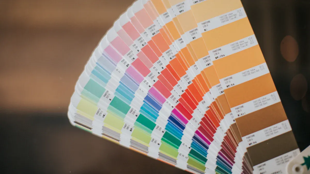
Fabric color plays a big role in how bright your screen printing designs look. Light fabrics like white or pastel shades help your prints stay bold and true. Dark fabrics can make colors look dull or different unless you use special techniques. The right equipment, fabric, and technique help you get the best results every time. Look at the table below to see how different fabric colors affect print brightness:
| Fabric Color Type | Impact on Print Brightness |
|---|---|
| White or light fabrics | Colors stay true and vibrant |
| Dark fabrics | Need a white underbase for bright, clear prints |
| High-opacity inks | Help prints look bold on dark backgrounds |
Fabric Color and Print Brightness
Light vs. Dark Fabrics
When you choose a fabric color for screen printing, you set the stage for how your design will look. Light fabrics, such as white or pale yellow, help your prints appear bright and true to the original color. These fabrics work well with water-based discharge inks. The ink can bleach the fabric to its natural shade before adding color, which makes your design pop.
Dark fabrics, like black or navy, create a different challenge. The fabric’s color can overpower the ink, making your design look dull. To keep your prints vibrant on dark backgrounds, you need to use special techniques and materials. Here are some ways professionals handle this:
- Use high-opacity inks, such as plastisol, that stand out on dark fabrics.
- Apply multiple layers of ink to boost the brightness of your design.
- Test your ink on a scrap piece of the same fabric before starting the full print run.
- Add a white underbase layer to block the dark color and make the top colors shine.
These steps help you get bold, clear prints, even on the darkest shirts.
Tip: Always check how your ink looks on the actual fabric before printing a large batch. This step saves time and helps you avoid surprises.
Color Perception in Screen Printing
Your eyes see color based on how light bounces off the fabric and the ink. The background color of the fabric changes how you see the printed design. For example, a red print on a white shirt looks brighter than the same red on a black shirt. The surface of the fabric also matters. Smooth fabrics reflect more light, making colors look sharper. Rough or textured fabrics can absorb more ink, which may make colors appear softer or less bright.
People see colors in different ways. The way your eyes process light and color can change how you view a printed design. The type of fabric, the ink you use, and even the lighting in the room all play a part in how bright and vibrant your screen printing looks.
Underbase Techniques for Screen Printing
Using a White Underbase
A white underbase helps your prints look brighter and more colorful. This layer works like a blank sheet under your design, especially on dark shirts. The white underbase covers the shirt color, so your inks stay bright and do not look faded. Many screen printers use this trick to get bold and steady results every time.
Here is a table that lists the main benefits of using a white underbase:
| Technique | Benefit |
|---|---|
| White Base Layer | Makes a base for bright colors |
| Opacity | Keeps colors strong and not faded by fabric |
| Color Accuracy | Helps match colors exactly |
| Texture-Free Finish | Gives a soft feel with little texture |
A white underbase also makes your print feel smooth and soft. You will see that the colors look deeper and stand out more. The thickness of the underbase is important too. A good layer bounces light and helps the top colors look brighter, making your design pop.
- Using a white underbase is key for the brightest colors on dark shirts.
- A good white underbase covers the shirt color, preventing the print from looking dull.
- Many screen printers use a white underbase to get bright and steady colors.
When to Apply Underbase
You should choose to use an underbase based on the shirt color and fabric type. Dark shirts almost always need a white underbase for the best look. Light shirts, like white or pastel, often do not need one because the ink colors stay bright. The fabric type matters too. Synthetic fibers, like polyester, usually show brighter colors than cotton.
The underbase is a base layer in screen printing, especially for dark shirts. Its main job is to make sure the main colors look bright and true. Without an underbase, the shirt color can change or dull the printed inks, so the design may not look right.
Here is a quick guide to help you decide:
| Criteria | Explanation |
|---|---|
| Shirt Color | Non-white shirts change ink brightness, so an underbase helps colors stay bright. |
| Shirt Style | Fabric type and seams can change how ink sits, so you might need an underbase. |
| Screen and Press Variables | Some printing setups need an underbase for sharp details and bright colors. |
You can also think about the design itself. Big or tricky designs may need an underbase for even color. By knowing when and how to use a white underbase, you can make your screen printing look great.
Fabric Types and Print Results
Cotton, Polyester, and Blends
The fabric you pick changes your print’s look and feel. Cotton, polyester, and blends all act differently with ink. Cotton soaks up ink easily. This gives you bright and clear designs with water-based inks. Cotton is a favorite for direct-to-garment printing. Polyester does not soak up ink like cotton. It works well with sublimation printing. The ink sticks to the fibers. This makes colors bold and long-lasting. Blends mix cotton and polyester. These fabrics are soft and let air through. Blends work with many printing styles. You get good prints and comfort.
Think about the printing method and the look you want. Cotton feels soft and classic. Polyester is tough and keeps colors sharp. Blends give you both comfort and good prints.
How Fabric Texture Affects Brightness
The texture of fabric changes how bright and clear your print is.
Fabric texture changes how bright and clear your print looks. Different fabrics soak up ink in their own way. This changes how your print turns out. Rough fabrics can mess up small details. Your design might look blurry or unfinished.
Smooth fabrics bounce more light. This makes colors look brighter and sharper. Rough fabrics soak up more ink. Colors can look softer or less bright.
The way threads cross in the fabric matters too. The weave changes how ink spreads and how bright your print looks.
| Aspect | Findings |
|---|---|
| Ink Penetration | Ink goes to the bottom of the fabric. The weave changes how ink spreads. |
| Ink Uniformity | Woven fabrics still look even, even with holes in the surface. |
| Impact of Weft Material | Different weft materials do not change how ink spreads. |
Knowing how fabric type and texture change your print helps you pick the best fabric for your next screen printing job.
Tips for Bright Prints in Screen Printing
Choosing Inks and Additives
You can make your prints brighter by picking the right inks and using helpful additives. Each ink type has its own strengths. Plastisol inks give you strong, bold colors and last a long time. Water-based inks can also look bright, but you may need to add special chemicals to get the best results. Direct-to-garment inks work well on cotton and show off detailed designs, but you need to treat dark fabrics first.
Here is a table to help you compare ink types:
| Pros | Cons |
|---|---|
| Pre-treatment is needed for dark fabrics, increasing costs. | Requires monthly maintenance and specific software settings. |
| Produces high-quality prints with great vibrancy and detail. | Pre-treatment needed for dark fabrics, increasing costs. |
| Soft and durable, lasting the life of the garment. | Limited compatibility with fabrics, primarily 100% cotton. |
You can also use additives to improve your prints. Additives help inks stick better, dry faster, or stretch with the fabric. Some additives make the print feel softer or help the ink soak into thick fabrics. Here are some common additives and what they do:
| Additive Type | Function |
|---|---|
| Binding Agents | Help ink stick to fabric fibers for brighter prints. |
| Cross-Linkers | Make inks dry faster and at lower heat, saving time. |
| Retardants | Slow down drying so you can print without the ink drying too soon. |
| Saturate Additive | Thin the ink for smoother printing, but use it carefully to avoid problems with drying. |
| Stretching Additive | Keep prints from cracking when the fabric stretches. |
| Soft-hand Extenders | Make prints feel softer and look sharper on rough fabrics. |
| Reducers | Thin the ink for smoother printing, but use carefully to avoid problems with drying. |
| Stretch and Puff Additives | Let prints move with stretchy fabrics and add texture. |
The secret to bright, true-to-life colors is in the pigments. You need to choose pigments that give you the most vibrant shades. Brightness makes your designs stand out and look professional.
You should also remember that different inks work best with certain fabrics. Some fabrics soak up ink better and make colors look more vivid. High-quality fabrics help you get the brightest results.
Testing on Different Fabrics
Testing is a key step before you start a big print job. You can avoid surprises by printing a small sample on the same fabric you plan to use. This helps you see how the ink looks and feels. You can also check if the colors match your design.
Here are some steps you can follow to test your prints:
- Keep your ink at the right thickness for even prints.
- Watch out for changes in temperature and humidity in your workspace.
- Check your prints often to catch problems early.
You can use test prints to see if your curing process works. For example, water-based inks need all the water to dry out before you heat them. Plastisol inks need to melt and bond with the fabric. If you do not cure the ink right, your prints may fade or wash out.
| Ink Type | Curing Requirement | Impact on Brightness and Durability |
|---|---|---|
| Water-based formulations | All water must dry before heating. Raise temperature slowly. | Prevents surface skinning and keeps colors bright. |
| Plastisol curing | Ink must melt and bond with fabric. | Makes prints last longer and keeps colors strong. |
| Specialty inks | Metallics need lower heat; discharge inks need careful timing. | Helps colors develop fully and stay true. |
Systematic testing and quality checks help you avoid costly mistakes. You can make sure your prints look the same every time.
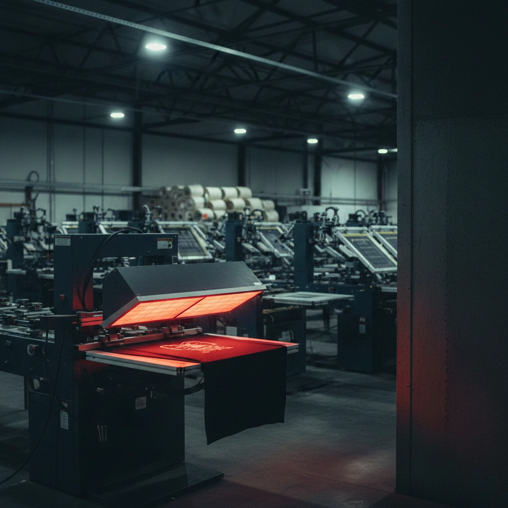
You should also think about your equipment. Machines like the H9PRO Series Full-Servo Oval Printing Machine from Cnding help you get even, bright prints on many types of fabric. Good equipment lets you control ink flow and pressure, which helps you get the best results.
- Light-colored fabrics reflect more light, making your prints look brighter.
- Dark fabrics absorb more light, so you need to use underbase layers or high-opacity inks.
- High-quality fabrics soak up ink better and make colors pop.
You can get the brightest prints by choosing the right ink, using helpful additives, testing your process, and using reliable equipment. These steps help you get the most out of your screen printing projects.
You can make your prints look bright by picking the right fabric color. Good materials and modern machines also help your designs stand out. Cnding’s automation lets you control how much ink goes on and how it dries. This makes your prints look better. Try these ideas for great results:
- Use special printers and water-based pigment inks for bold colors.
- Test your prints and use quality checks to keep colors the same.
- Choose eco-friendly ways to cut down on waste and help the planet.
Real-life stories show that planning and smart machines give you amazing prints every time.


